In my post on Friday 12th June I was looking at an inflection point on multiple US equity indices where I was expecting to see a number of H&S patterns to fail with targets at retests of the all time highs (ATH). The H&S patterns failed, and we saw ATH retests on DIA and IWM, but never saw those ATH retests on SPX or QQQ.
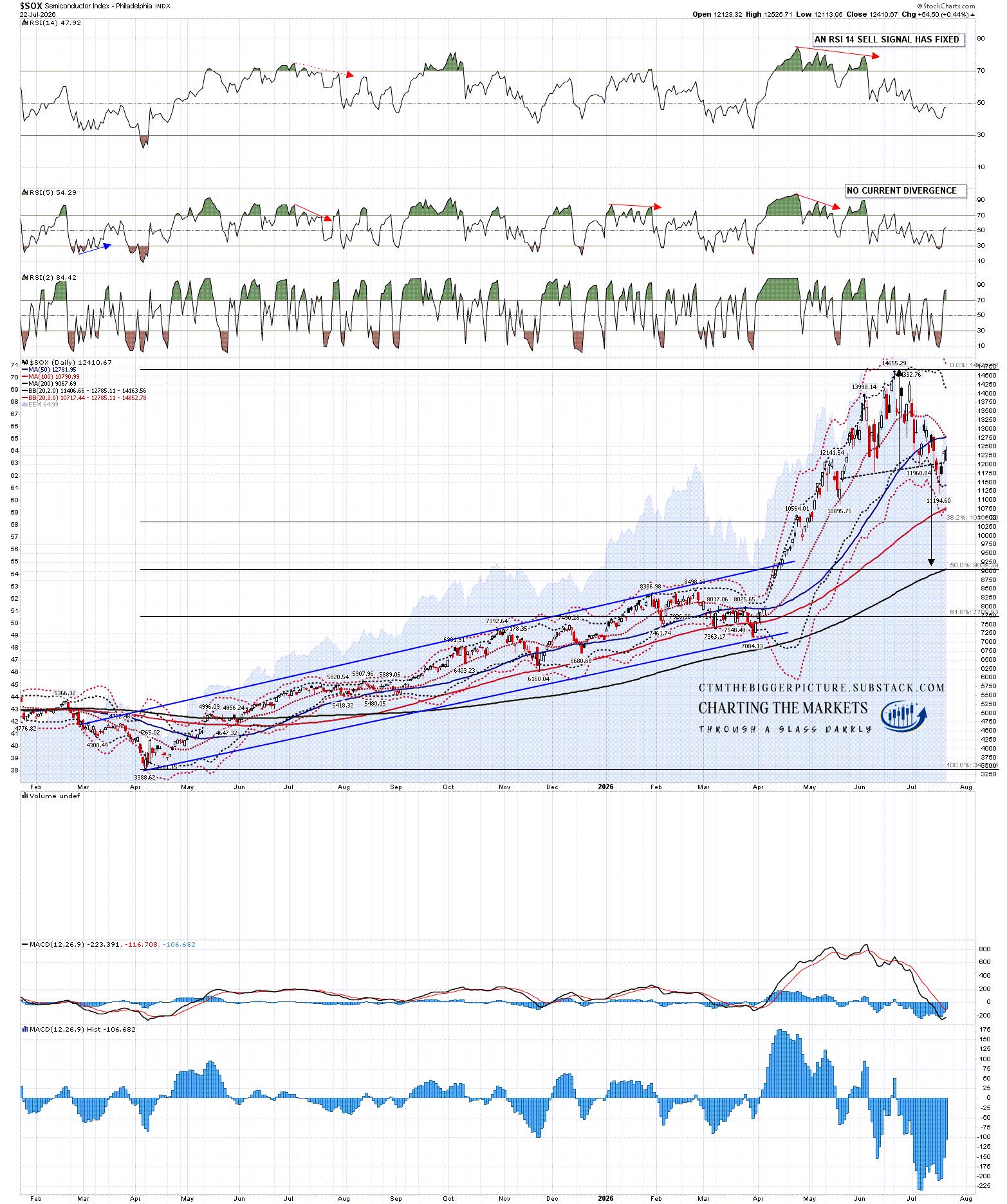
The main reason we never saw those retests was the weakness on the Philadelphia Semiconductor Index (SOX) which dropped over 20% from the June high into the low last week.
There too we see another H&S, which has broken down with a target in the 9150 area and the main reason we have seen a decent rally attempt on SPX and QQQ this week is that we have been seeing a strong rally on SOX, with a possible target at the daily middle band, currently at 12,785.
SOX too is in an inflection point here, where either that H&S continues down towards the target, or rejects back up to the high. The dividing line for that is at the H&S right shoulder high at 13249.07.
SOX daily chart:
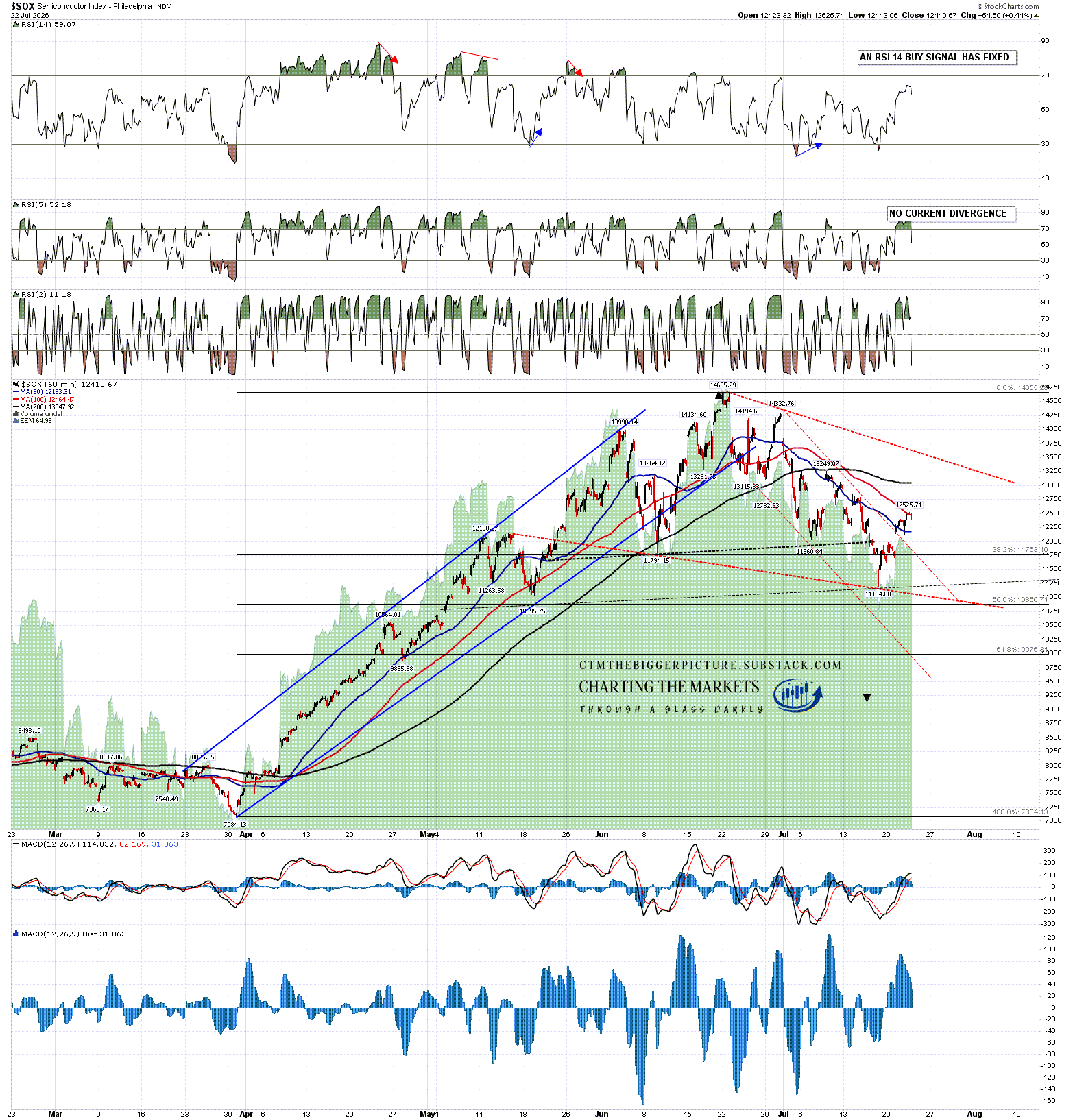
What are the chances that SOX is starting to reject back to the all time highs? Well there is a decent setup on the hourly chart, with a possible alternate bull flag falling wedge formed from the high. On the pattern setup I’d give this 70% odds of continuing down, and 30% odds of rejecting back up to the highs.
SOX 60min chart:
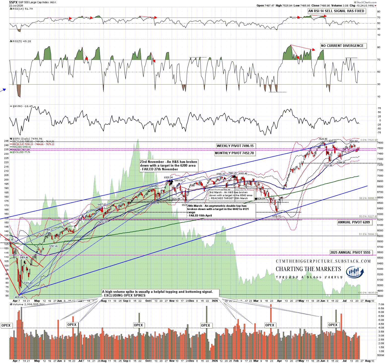
On SPX we saw a break back over the daily middle band on Tuesday, with a confirming close above yesterday. This could be the start of a break up towards towards an ATH retest, but we need to see more evidence of strength from SPX and from the other US indices, as all of DIA, IWM and QQQ are still closing below their daily middle bands.
SPX daily chart:
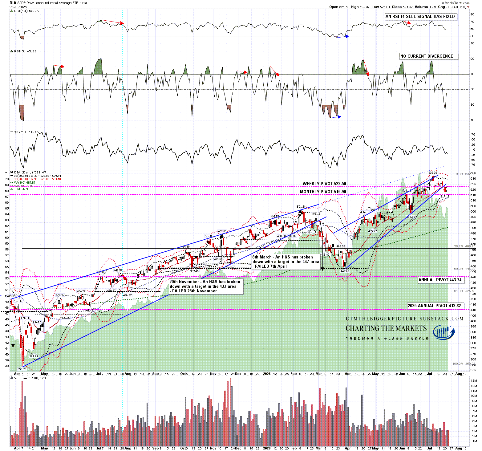
DIA has been testing the daily middle band over the last two days but has closed both days below:
DIA daily chart:
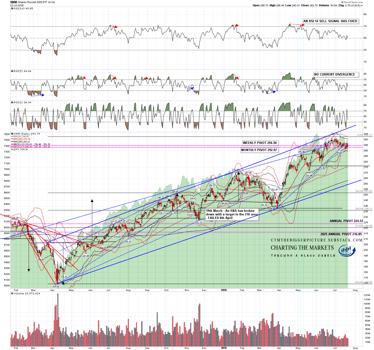
IWM has been testing the daily middle band over the last two days but has closed both days below:
IWM daily chart:
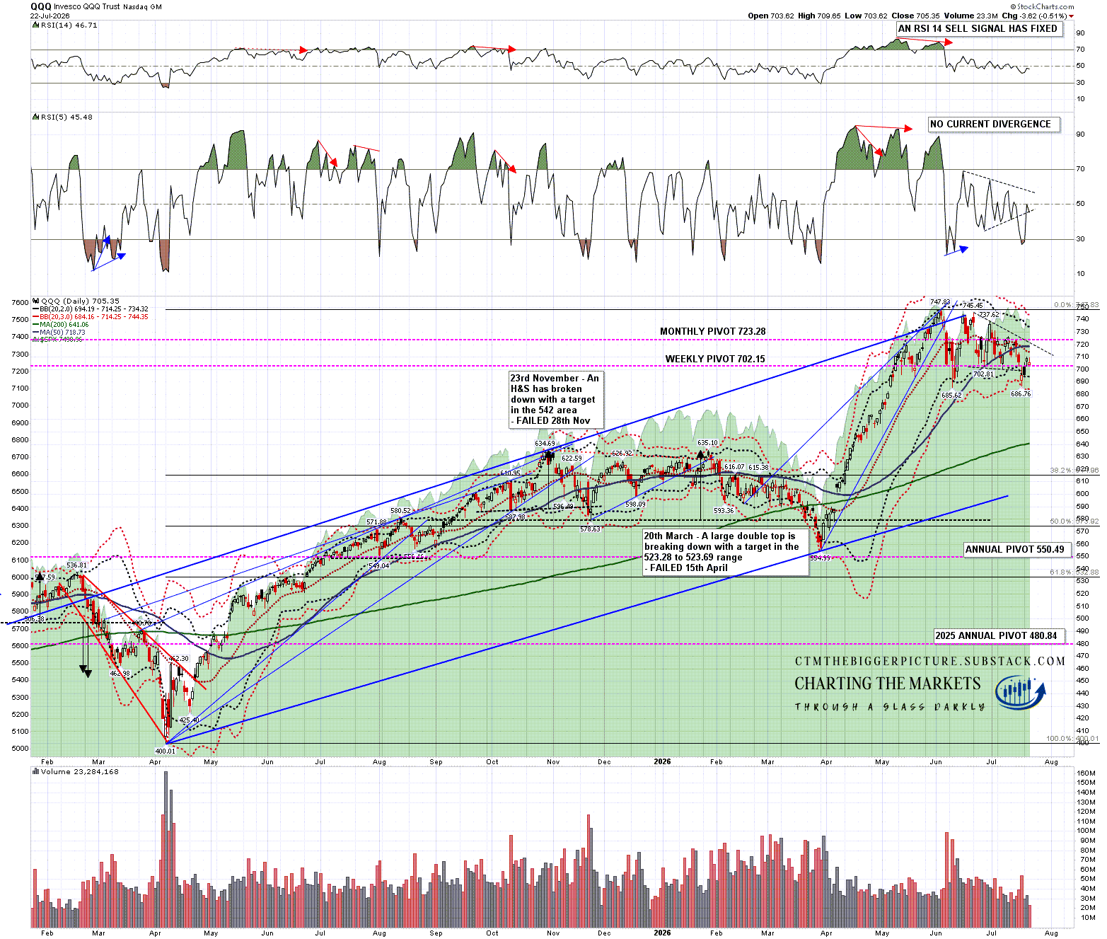
QQQ has been trailing the others over the last month, in significant part due to the weakness on SOX, and I was talking in my The Bigger Picture webinar on Sunday for paying subscribers on my The Bigger Picture substack (circa 5min mark) about QQQ hitting the 3sd daily lower band on Friday as that is a good level to see a decent rally. We’ve seen that rally but, as with SOX, QQQ is still well below the daily middle band and would need a strong break above it to open a retest of the ATH.
QQQ daily chart:
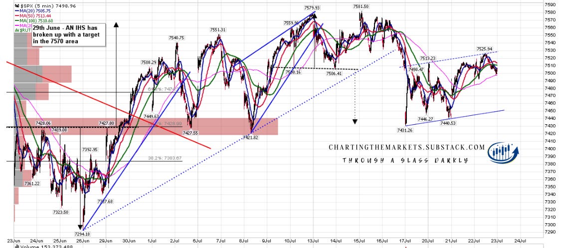
Is there a setup for SPX to fail here? Yes. On the 5min chart I drew in an ideal bear flag channel resistance trendline on Tuesday and as you can see, that trendline turned out to be the rally high so far. If we don’t see a break up on SPX I’d expect to see a retest of Friday morning’s low soon.
SPX 5min chart:
I’m keeping an open mind here as I still have those targets at retests of the all time highs on SPX and QQQ, and that looks like unfinished business. Overall though I think this setup is still leaning towards seeing a retest of last Friday’s lows next. A stronger and wider break up on US indices could change that, so we’ll see today or tomorrow whether that can be done.
If you like my analysis and would like to see more, please take a free subscription at my chartingthemarkets substack, where I publish these posts first. I also do a premarket video every day on equity indices, bonds, currencies, energies, precious commodities and other commodities at 8.45am EST, but only for paying subscribers. Other places to find me are my page on the platform previously known as twitter, and my YouTube channel.