In my last post on oil and natural gas I was talking about starting to do a post every week or two reviewing a single instrument that I cover in my futures and currencies charts on multiple timeframes to sketch out the higher probability paths going forward. This is the first of those posts, apart obviously from my earlier posts on oil and nat gas. I’ll be aiming to do one of these posts every week.
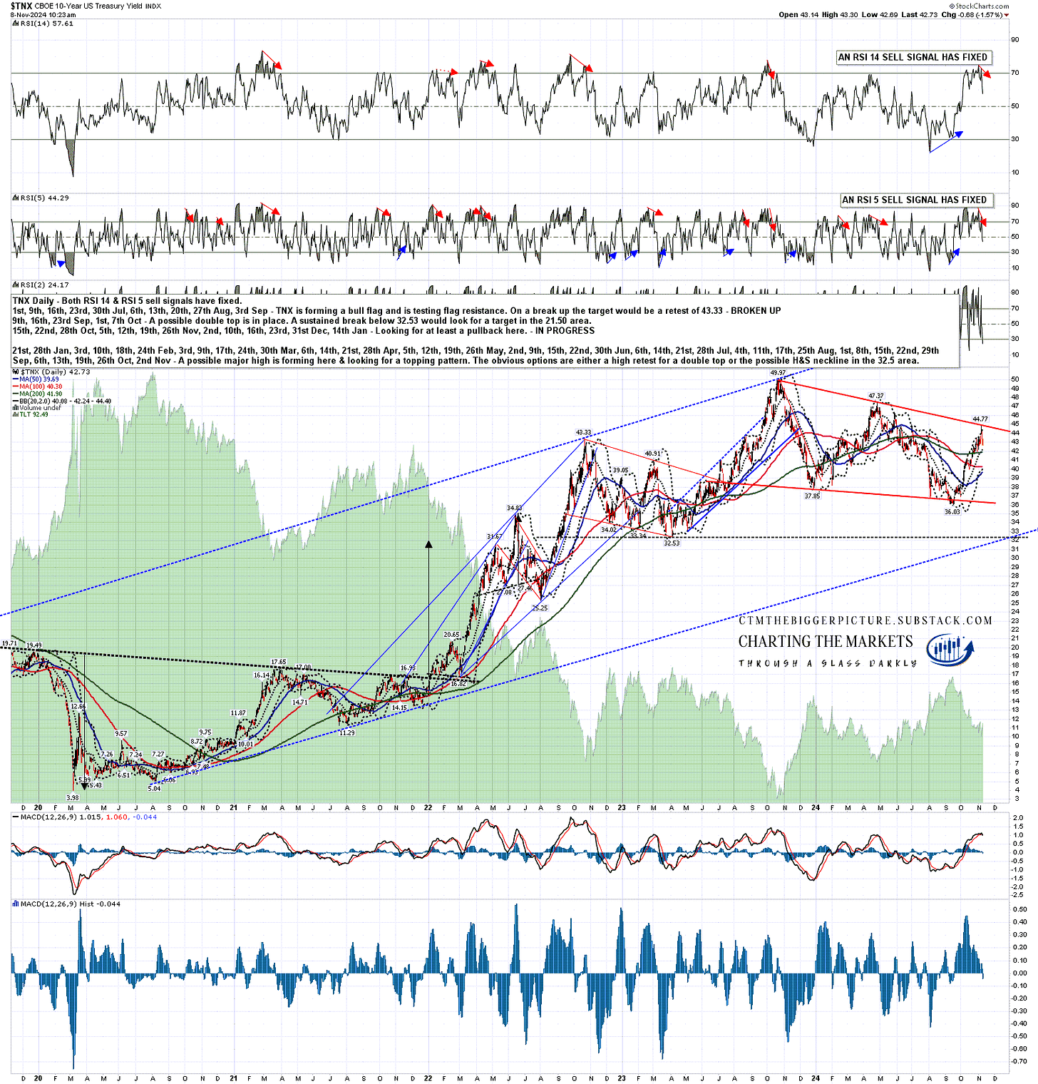
This week I’m going to look at a very important inflection point that looks likely to be coming up on US treasuries over the next few months to a year. I wrote in January on the TNX daily chart below that I was expecting a possible topping pattern to form, either a double top or an H&S after a test of the obvious possible H&S neckline at 32.53.
Three months ago I was leaning strongly towards the H&S option as inflation had returned almost to the Fed’s target, and the Fed was likely to start cutting rates, but to my surprise a retest of the 2023 high at 49.97 on TNX to form the second high of a possible double top now looks like the obvious next big target after we see some retracement here.
Why is that? Well the rally on TNX from the September low at 36.03 to the high at 44.77 this week was not something I thought was likely after the drops this year in inflation and the start of the Fed cutting interest rates, but I had drawn in a possible bull flag pattern that I was thinking could be forming and TNX perfectly hit and confirmed that bull flag falling wedge at the high this week.
As a matter of fact I was looking at a very similar setup a few days ago when SOLUSD (Solana) hit flag resistance there. Again there was a good setup for short term reversal there that delivered, and after that Solana broke up from the flag and has now reached the flag target at the retest of the 2024 high at 209.86. You can see the post I wrote on 30th October at that flag resistance test here, and the SOLUSD daily chart I showed in that post with the bull flag resistance test is here.
What is the obvious path forward for TNX here? Pretty much exactly what we have seen on Solana since, a pullback short term, then a break up through bull flag resistance towards the flag target at the retest of the 2023 high at 49.97. It probably won’t play out as fast though.
TNX daily chart:
If that bull flag target on TNX is reached, there would then be a possible double top setup on TNX that on a subsequent break down from 32.53 would be looking for a target in the 15 area. If seen that would be a return to the very low interest rates that marked the lows on TNX in the 2011-6 period. That isn’t the only scenario however.
At that high retest we would have an inflection point where TNX could also break up. Equally, if that double top broke down instead there would be another inflection point, where TNX could continue down to that target in the 15 area, or reject back up to the decade highs.
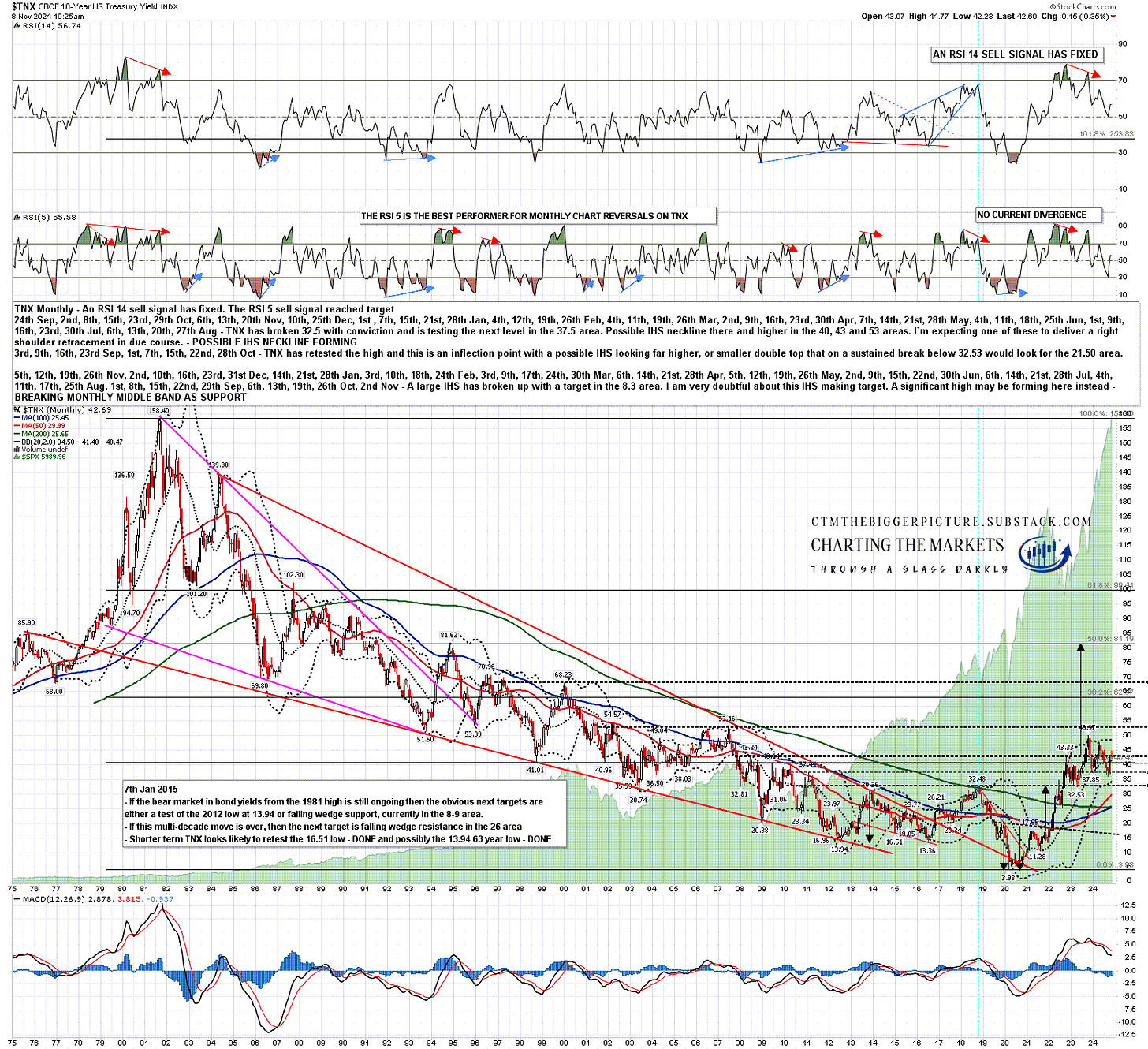
TNX monthly chart:
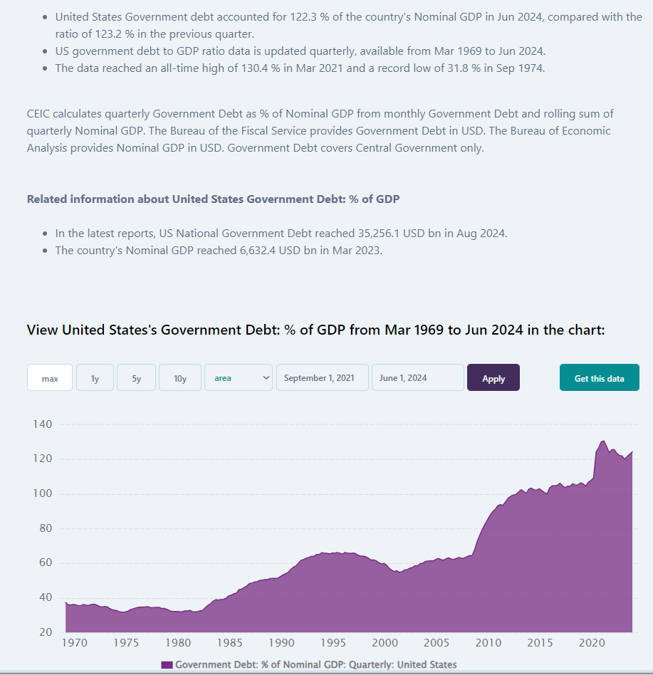
Under what circumstance might we see longer term interest rates hit 5% or higher for an extended period in the next few years? Well the US is at a delicate point in terms of government debt, with government debt in nominal GDP terms doubling to 130% between 2009 and the COVID debt high in 2021. For reference, the peak on US government debt to GDP in the last century was at 106% in 1946 after WW2, and that then fell to just 23% in 1974, as the last serious inflation and interest rate shock was getting going.
US government debt at this level constrains the options of this incoming administration in a way that it did not in the 1970s. Why is that? It’s because while TNX rose from a low at 53.8 in 1971 to 158.40 in 1981, effectively a rise in interest rates of 5.38% to 15.84%, debt was low, so while the interest rate shock was very serious, it was still manageable. That’s not the case now, and if the US government fails to keep bond markets happy with the direction of policy and the effect of that policy on debt, the results won’t be pretty.
As an aside one thing worth noting on the chart below is the drop in debt vs GDP just after the 2021 high from 130% to 120% two years later. Was this because of the administration’s fiscally conservative policies? No, it was because of the inflation that was triggered by all that COVID over-stimulus. Cumulative inflation since 2021 has been 16.4%, and that increase is in the nominal GDP figures as well as growth over the period. That increase in nominal GDP was therefore just a lot more than the increase in government debt over that period. That is the key reason that government debt remained low and on a downward trend 1971-1981.
CEIC 1969-Date US Gvt Debt to GDP chart:
So why is the level of debt now such a constraint? Well two parts of one reason, and the first part is that the general rule of thumb on government debt in terms of GDP is that a level over 135% of GDP is historically the level at which bondholders need to start being seriously concerned that the government they are lending money to may default rather than repaying their money at the expiry of that government bond. A move over that level, or a policy direction that risks moving debt over that level brings us to the second part which that a loss of confidence by the bond market in a governments ability to repay their debt is shown in much higher interest rates, and when debt is that high already, that risks making the situation much worse.
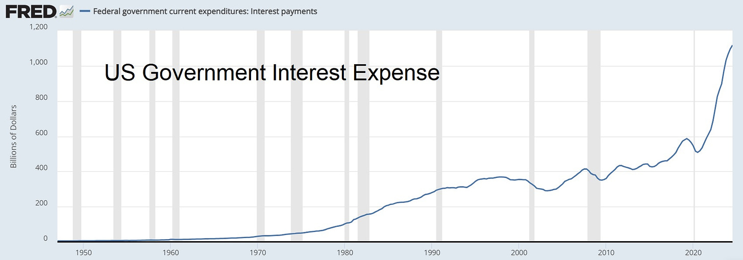
To illustrate that, let us consider the chart below, where you can see that the cost of servicing US government debt has increased from a low in 2020 at an annualised $500bn to more than double that in 2024, an annualised increase of $600bn per year due in small part to an increase in the level of debt, but mainly to rising interest rates over the period.
US government debt is currently slightly under $36 trillion dollars. At an average interest rate paid at 2% the annual interest cost would be $720 billion dollars per year. In 2024 you can see that the average interest rate paid is about 3%, so the annual interest cost is at about 1.08 trillion dollars per year, and for every 1% rise in that interest cost that cost will increase by $360 billion dollars per annum.
For reference, US military spending in 2024 is at about $850 billion, and that is at about half of all discretionary (non-mandated) spending by the federal government in 2024. An increase of 5% in the average interest rate paid on US government debt would therefore be an increase of more than the whole of current federal government discretionary spending. At the current level of indebtedness, it is very important not to upset the bond markets.
FRED 1948-Date US Gvt Interest Expense:
This is liable to cast a long shadow over some of the possible policy changes that Trump was talking about on the campaign trail, notably:
Taxing & spending: Any increase in deficit spending that significantly increases the level of debt to GDP will likely result in higher interest rates.
High trade tariffs: Inflationary and would likely result in higher interest rates.
Substantially reducing the value of the US dollar against other currencies to increase exports: inflationary and would likely result in higher interest rates.
That doesn’t mean these can’t be done, but that they would need to be done carefully, and might need to be reversed quickly if the bond market reaction was sharply negative. The net result of this pressure may well mean that Trump becomes the first President since Clinton, and the first Republican President since Nixon, to oversee an overall reduction in government debt to GDP during his next term in office, and that would likely also have been the case for Kamala Harris if she had won instead. The incoming US President is standing on a mountain of debt close to a cliff edge, and the fast way to the bottom is not one anyone would willingly choose. The slow way down from the mountain will take a long time and require some hard choices.
Could the Fed solve this problem by keeping interest rates low? No, real long term interest rates are set by the government bond markets, and those long term treasury yields, ten year yields on TNX and thirty year yields on TYX, are determined by supply and demand on those bond markets. That’s the reason that while the Fed has reduced their benchmark rate by 0.75% over the last two months, government bond markets raised the yield on US 10 year treasuries by 0.88% over the same period. The Fed doesn’t control bond markets, any more than sailors control the sea.
US Debt Clock:
I think that at least two big western governments are at serious risk of defaulting on their debt in the next decade. The first is Japan, with government debt to GDP at an amazing 255%. Japan was described by John Mauldin as a (fiscal) bug looking for a windshield in 2011 and remarkably is still looking for that windshield, mainly as most of that debt is owed to Japanese citizens at ultra-low interest rates outside bond markets. Singapore has a high looking government debt to GDP at 167%, but net government debt is actually zero and their debt is AAA. Greece (not big but western) and Italy are next at 172% and 144% of GDP respectively and but are protected by low interest rates in the Euro area, so far at least. All the others above the USA on the top 20 countries with the biggest national debts have interest rates above six percent with outliers like Sudan and Venezuela with interest rates at over 40% and 60% respectively.
The way this world government debt bubble plays out will be one of the most interesting economic stories of the next two decades. Take a free subscription to my substacks and watch it with me as it plays out. :-)
If you like my analysis and would like to see more, please take a free subscription at my ctmthebiggerpicture substack, where I will be publishing my posts covering other than equities or crypto, and where I do my The Bigger Picture webinars on Sunday and Wednesday nights.
If you like my analysis and would like to see more of my work on equity indices, please take a free subscription at my chartingthemarkets substack, where I publish my equity index posts, and do a short general premarket review every morning.
If you like my analysis and would like to see more of my work on crypto, please take a free subscription at my ctmcrypto substack, where I publish my crypto posts, and do a short crypto premarket review every morning.


No comments:
Post a Comment