
I’ve been mulling over the best way to do my review of the US dollar, US treasuries, and why the US dollar may lose its status as the world’s main reserve currency, and how that might look, and I’m splitting this into three posts this week.
The first post is this one and will look at the US dollar and where it may go from here.
The second post will look at US treasuries and where they may head from here.
The third post will be looking at the US dollar’s status as the main reserve currency, US treasuries as the main reserve asset for US dollars, why that may already be changing, and what other options might replace it over the next few years.
I’m going to try to get all three posts out over the first three days this week, but the third one, as the most complex, may slip until Thursday or Friday this week.
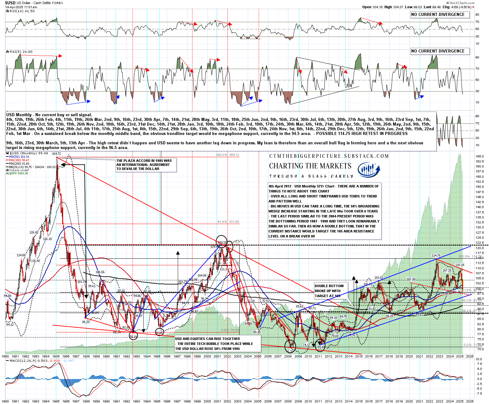
On the USD monthly chart below the main pattern is a good quality rising megaphone from the low in 2011. The last hit of megaphone resistance was at 114.78 in late 2022 and since then USD has been declining towards the obvious target at rising megaphone support, currently in the 96 area. Here is an old Chart Chat video where I was looking at this on 2nd November 2022 starting at 11.45 into the video.
The obvious overall pattern here from the 2022 high at 114.78 is that a bull flag is forming but I would note that about 30% of these break down, so this may be a topping pattern. If this was to break down the target would be in the 77 area, back into the 70-90 range that USD has spent about half the time since 1987 trading in.
Why am I referencing old videos? Two reasons. The first reason is that I haven’t done a post on the US dollar for a decade or so, so I want to demonstrate to my newer readers that I have been doing videos on the US dollar very regularly for a long time, and that I’ve called it pretty well historically so my forecasts have significant weight. You can see on the chart below my note from 2012 looking at the double bottom setup on USD and my note from 2014 of the double bottom target at 105. If you have any doubts I still have the original charts and posts that I published at the time. :-)
The second reason is to show that everything we are seeing on the US dollar at the moment is within target ranges I’ve been calling for years now so none of this, so far at least, necessarily has much to do with the actions of the Trump administration. Correlation is not causation.
USD monthly chart:
On the daily chart you can see what has happened on USD since that high at 114.78 in 2022. There was a sharp falling wedge decline into a low in July 2023 which I called, then a smaller rising megaphone forming into a big inflection point in January this year. I was talking about that in my The Bigger Picture video on 5th January (starting at 24.22 in this video) as an inflection point where USD should either break up into a retest of 114.78 or fail lower towards the bigger picture trendline target now in the 96 area.
This pattern was in effect a larger bear flag which made target in the 99.2 area last week and I was talking about this move down being part of a likely C wave which would fit the overall bull flag setup I was looking at on the chart above.
USD daily chart:
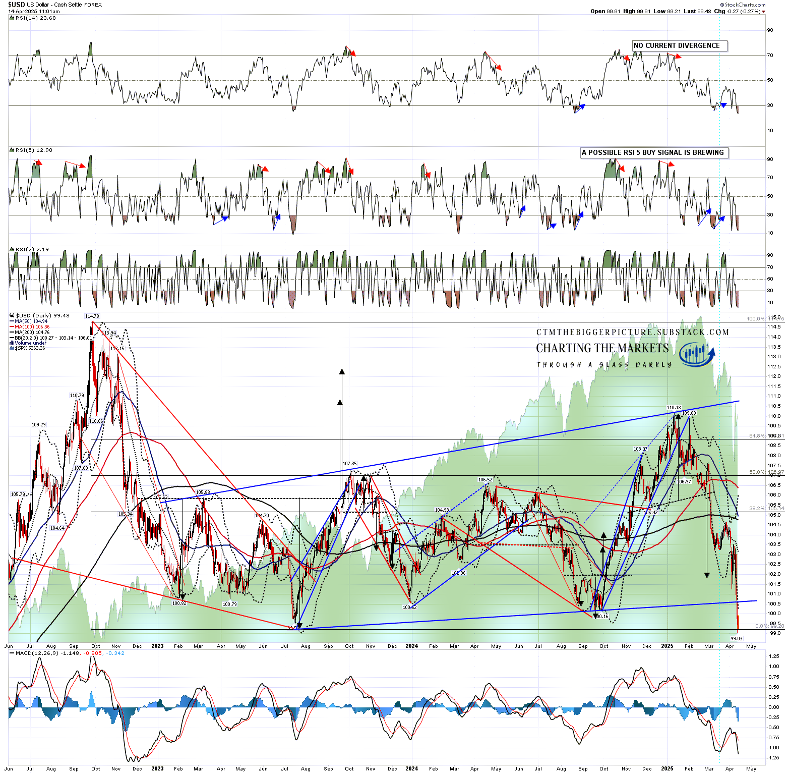
This brings us to where USD is now and this is the point where the Trump administration may start to have a more obvious impact on USD direction. The obvious next target is an inflection point in the 96-7 area which would lean 70% towards a break up into at least a retest of the 114.78 area, but the other 30% option would be a hard break down towards a target in the 77 area.
So how does this inflection point look on the other currency charts?
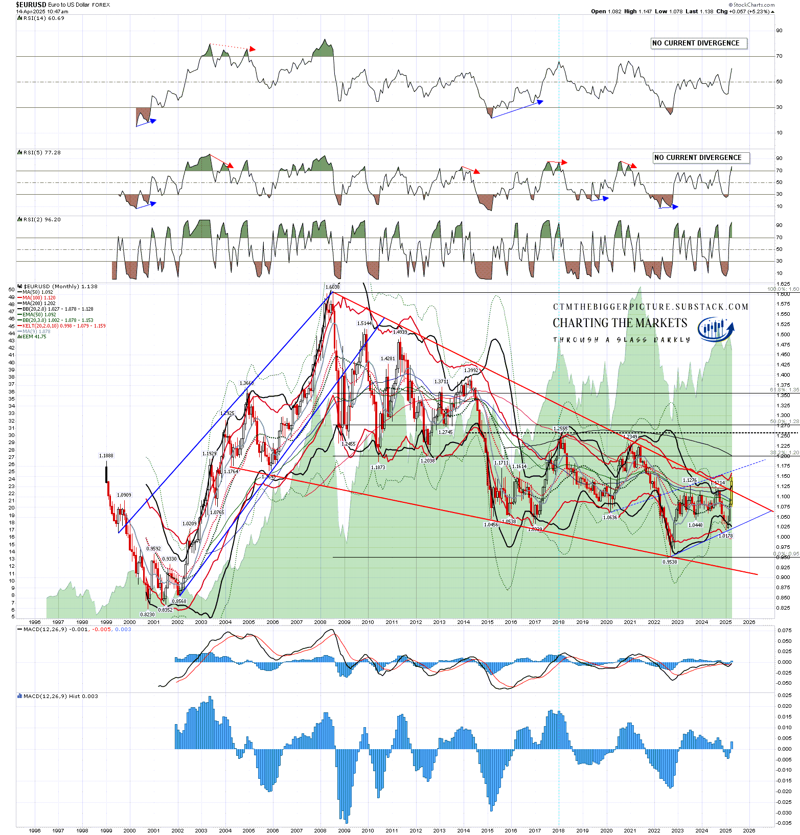
On EURUSD the pattern from the high in 2008 was a falling wedge which has already broken up. I would note that the obvious current pattern forming would be a bear flag which would be almost a mirror image of the bull flag forming on the USD chart. That’s to be expected as the Euro has a 57.6% weighting in the USD index.
On the bigger picture there is a possible double bottom or part formed H&S here and a sustained break over 1.2555 for either would have a target not far below the 2008 high at 1.6038. That would be a strong match with the USD target in the 77 area that I was talking about in the chart above.
EURUSD monthly chart:
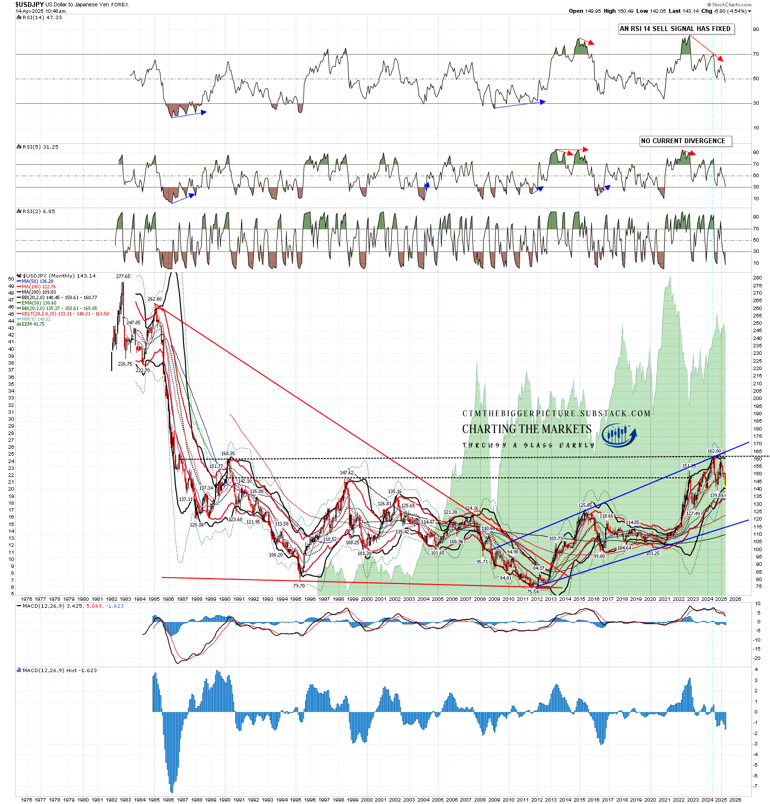
The Japanese Yen has a 13.6% weight in the USD index but as with the Canadian Dollar, is most commonly looked at inverted on USDJPY, which means that a decline on USDJPY is the Yen getting stronger rather than weaker.
USDJPY made a significant looking high last year at 162 and the next obvious target within the rising megaphone from the 2011 low would be megaphone support, currently in the 115 area. That would be an 18% or so decline from the current level and would support a sharp decline on USD.
From there I have both bull and bear options. On the bull option an IHS right shoulder could be forming here that on a subsequent sustained break over 162 would look for a target in the 250 area, back into a range not seen since the early 1980s. That would fit with a huge rise on USD which seems very unlikely at the moment but is worth bearing in mind as a possibility.
The bear option is a break of megaphone support and a reversal back towards the 2011 low at 75.54. That would effectively be the US dollar almost halving against the Yen from current levels.
USDJPY monthly chart:
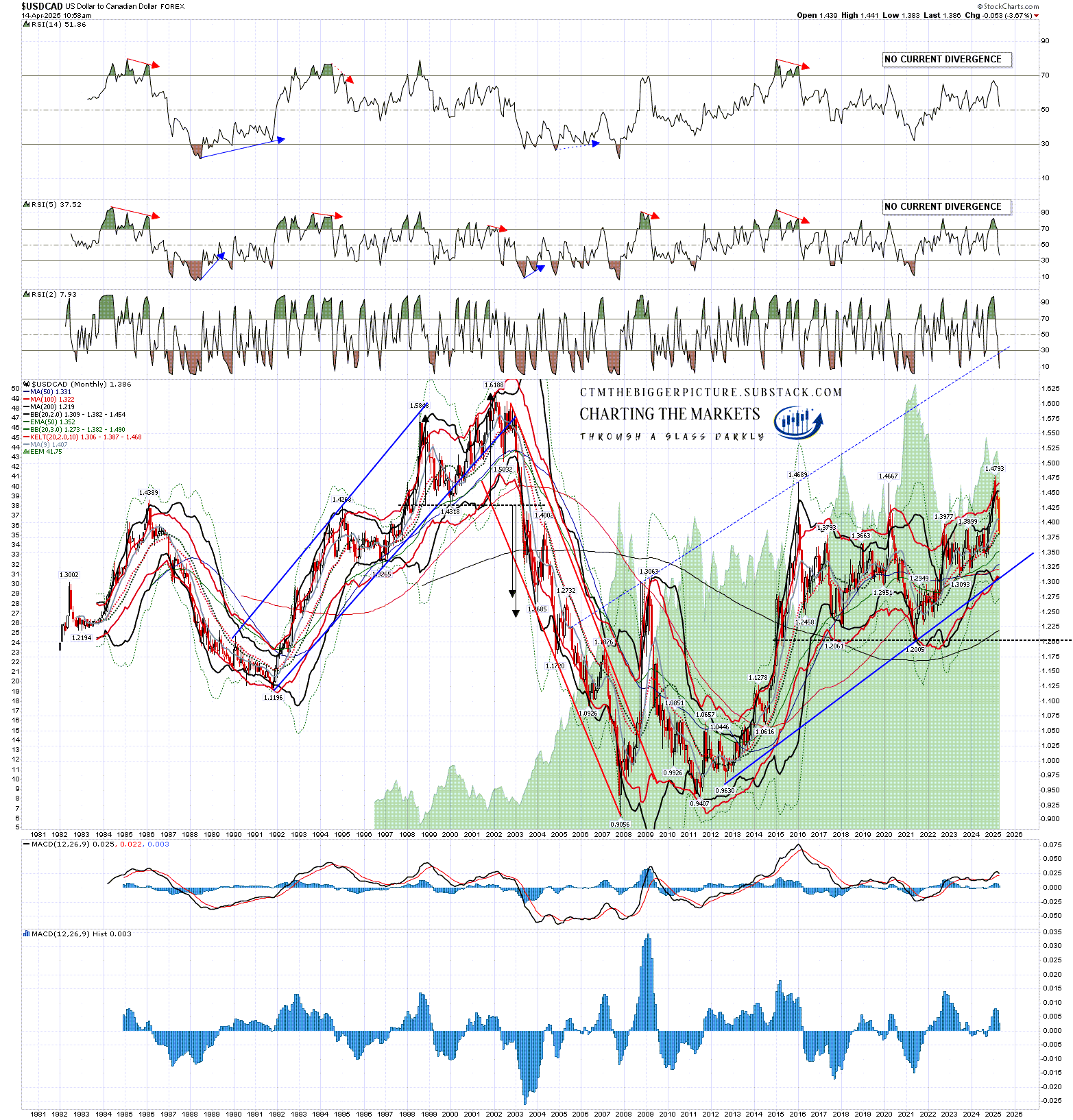
The Canadian Dollar has a 9.1% weight in the USD index but as with the Japanese Yen, is most commonly looked at inverted on USDCAD, which means that a decline on USDCAD is the Canadian Dollar getting stronger rather than weaker.
USDCAD made three significant looking highs in the same 1.465 to 1.48 area in 2015, 2020 and early 2025 and the obvious pattern read is a double top (there is no such thing as a triple top) that on a sustained break below 1.2005 would look for a target in the 0.92 to 0.935 area. In effect that would look for a retest of the 2007 low at 0.9056. That would effectively be the US dollar dropping about a third against the Canadian Dollar from current levels.
USDCAD monthly chart:
The setup on GBPUSD looks supportive as well though I won’t show that and between those four currency pairs with the US they are 92.2% of the US Dollar Index.
Is the US Dollar overvalued by historical standards? No, though I’d note that for the entirety of the period shown below from 1967 the US Dollar was the main reserve currency, which would tend to overvalue it. That said, USD is already near the bottom of this range and the kind of decline on the US Dollar that I am looking at here would be in effect a retest of the lows, perhaps to make a bigger picture double bottom.
USD 1967-2015 chart from Stooq.com:
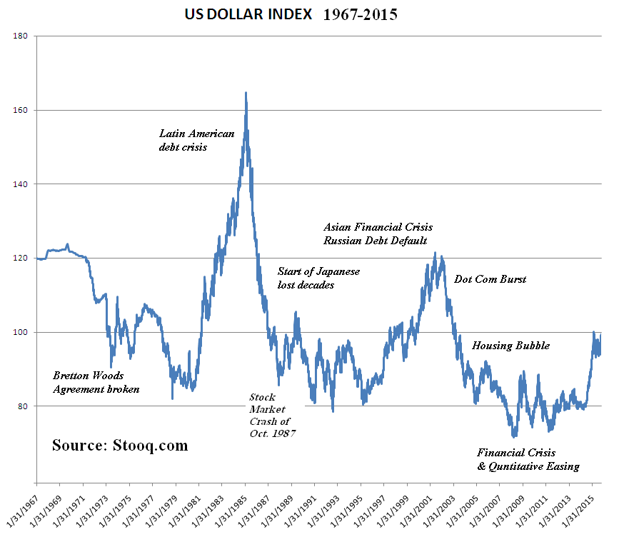
I’ve been watching the US Dollar every day for over 15 years now, and I’ve been expecting for the last few years that this chart was likely heading towards a retest of the lows made in 1992, 1995, 2008 and 2011 in the 70-80 range. That said, given the flags forming on the USD and EURUSD charts I was leaning more towards that happening in the next three to ten years as it takes a while for these moves to play out. Under the right circumstances though that could happen a lot faster.
Look out for the next two posts in this series which will be published over the next couple of days.
If you like my analysis and would like to see more, please take a free subscription at my thebiggerpicture substack, where I publish these posts first and do bi-weekly videos looking at equity indices, bonds, currencies and commodities. If you’d like to see those I post the links on Wednesday and Sunday evenings on my twitter, and the videos are posted on my Youtube channel.
No comments:
Post a Comment